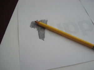
As I sat here coloring my poster for an upcoming Open House, I want to share my secrets on creating this masterpiece with all of you! So here is the scenario – there is an event, school project, or something you need a poster for, and you don’t have the best drawing skills or handwriting. So you want it to be legible right? Here is a trick I learned, although I’m not sure where! You need to have a computer with a word processing program like Microsoft Word, or a desktop publishing application like Microsoft Publisher, or similar. Once you have decided what you want your poster to say, type one word to a page. Use a large, legible font that is fun or pretty. Make sure you use black ink only. Color ink will not work for this project. Before you print the words, reverse the font so that everything is backwards. On your poster board (don’t use the glossy side) arrange your words where you want them. Take a pencil and trace, or just rub over, the back of the paper like so.
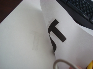
Once you have done the first letter, lift your paper to see if you are applying enough pressure. You will see a faint tracing of the letter.
Repeat this process until you have finished with all of your lettering. You can even do rubbings of clipart onto your poster board too. This is helpful if your drawing skills need a boost. Fill in your letters and clipart with markers, colored pencils, or crayons.
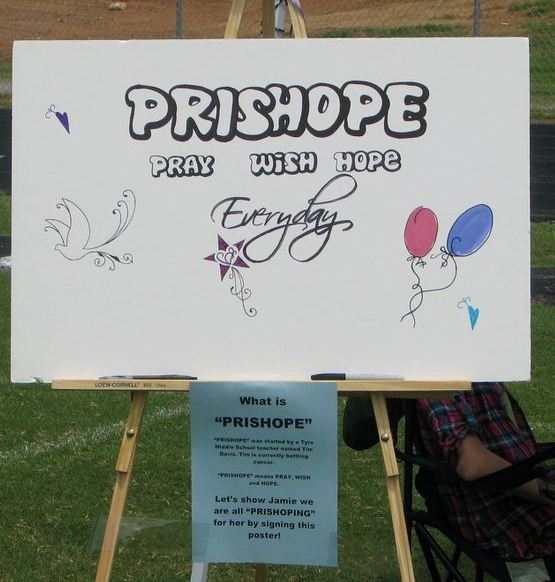
Here is a poster I did for a fundraising event last summer. All of it was traced, but it looks like it was hand drawn! ![]() Good Luck and happy coloring!
Good Luck and happy coloring!


