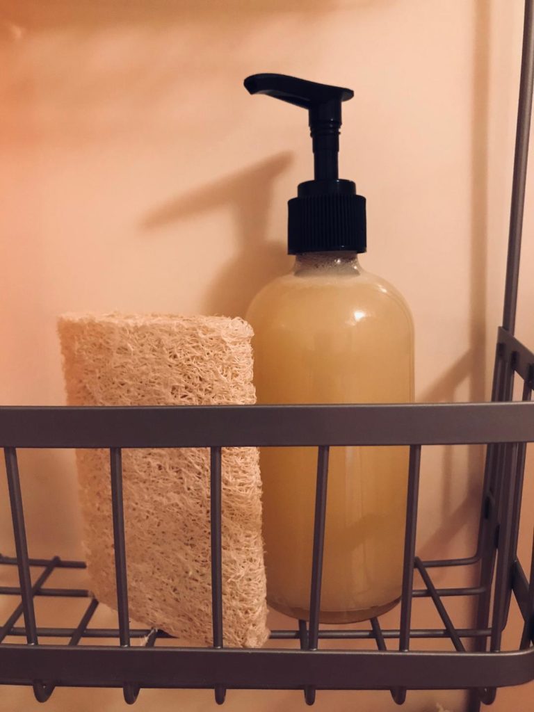
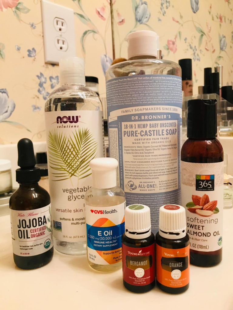
Office to Evening: Layered Summer Fashion

With the recent heat dome covering most of the United States, many of us are dealing with record high temps outside. But what about inside? For those of us lucky enough to work in an office, the climate can be quite different. Look familiar?

heat
It is always freezing in my office because a coworker keeps the air conditioning set to subarctic levels. Every morning I stand in my closet and ponder, “What do I wear today that will be appropriate for the forecasted triple digit record highs, knowing that the office is going to feel like I just walked into a refrigerator?” Staying warm in the air conditioning doesn’t have to be unfashionable. And you shouldn’t have to pack a second set of clothes to change into if you’re meeting friends for dinner after work. I have compiled a list of essentials for the professional to help win this battle.

Women’s Essentials


LEGGINGS: Leggings are the perfect complement to the cute summer dress. I prefer leggings over tights for two reasons; they come in both a variety of thickness and length. It is very easy to customize a degree of warmth that is perfect for you by selecting a thicker ankle-length legging or a thinner capri-length. Don’t forget, if your dress is solid color, add a splash of fun with a patterned legging. Bonus: Leggings don’t cover your feet so you can easily slip out of your leggings quickly, and without having to unbuckle and take off your fashionable sandals. You’ll shed that layer and be ready for a warm summer evening in less than a minute!


ANKLE BOOTS: Ankle boots are so adorable, and can pair with just about any outfit during any season of the year. They’re fashionable and functional! Those of you like me, who can never get warm unless your toes are warm, will appreciate that ankle boots can discretely hide a pair of no-show socks! Toss a pair of thin sandals or flip flops into your purse, and change out of your ankle boots and socks before heading out for the evening.


KIMONO: The kimono has to be one of my favorite new fashion trends. They look great paired with a blouse and dress pants or with a white tank top and jean shorts. A kimono can be worn over a sundress or a semiformal dress. This piece is so versatile; every woman should own one! Admit it… layering has never been more chic.

Men’s Essentials


HOODIE: Hoodies aren’t just for game day! Layers can sometimes be uncomfortable, but hoodies provide a lot of comfort and warmth. I mean, who doesn’t love wearing a hoodie? They’re also extremely easy to care for. A classic black, navy, or gray hoodie is very acceptable in an office setting. Leave one hanging on the back of your office door for warmth and style.


VEST: Men’s vests are always in style. This classic piece is perfect for layering. They come in a variety of styles and material, and are probably as versatile as the women’s kimono. They can be worn over both t-shirts and button down shirts, and are an easy transition for the cold office.

UNDERSHIRT: Undershirts, like women’s leggings, come in a large selection of styles and thickness. Although it isn’t as easy to remove this layer, companies like Tommy John create awesome undershirts that can be worn as a single layer t-shirt. With its premium, stay dry fabric, this comfy and cool option is perfect for a casual night of drinks with the guys. [Tommy John not only specializes in t-shirts, but they offer a great selection of men’s underwear as well.]

Essentials for Both


CARDIGAN: The Cardigan will always be a favorite of mine. Classic and comfy, it speaks for itself. Originating in the 1800s, the Cardigan proves that it is here to stay. It is an office staple for both women and men.


SCARF: Scarves are typically thought of as a winter accessory for both men and women. However, if you’re looking for an easy layer of warmth, consider the scarf as an office accessory too. Scarves come in an array of lengths, fabrics, and colors/patterns to complement any outfit. And they are extremely trendy for guys and gals!


JACKET: The number one office go-to for layered summer fashion is, without a doubt, the jacket. The ultimate in class and versatility, a jacket pulls together an outfit while offering an extra layer of warmth. However, when you think of jackets, you shouldn’t only think of suit coats. Consider all cuts and materials, including the Summer Blazer for men. They come in a variety of styles, even offering different sleeve lengths, and fabrics, including linen and seersucker as popular choices. Ladies, don’t rule out denim. A tailored jean jacket over a sleeveless blouse adds style and comfort to white dress pants or a patterned pencil skirt. Slip the jackets off for the easiest of transitions to a dinner date or an evening out with friends.

I hope that my list of Office-to-Evening essentials have been helpful. If you’re still a bit overwhelmed, consider incorporating one or two pieces at first. Not sure you can pull off a scarf or leggings? That’s okay! Start with classic pieces and build from there. The thing to remember is that layers are key in helping you transition from a frigid office setting to a hot night on the town.


I was not compensated for this post, and it contains no affiliate links. All opinions are my own and not influenced in any way. Photo credits can be viewed by hovering over each image above. All sources found online.

Trail Mix Bites: A Healthy Sweet & Salty Snack

If you’re like me, you’re on a mission to keep your New Year’s Resolution(s). But the later into January we get, it seems to become more of a struggle to stay on track. Am I right? One of my goals for this year is to make healthy eating choices. This goes above monitoring calories, fats, and carbohydrates. I want to choose organic, whole foods as my options for both meals and snacks. What I am finding is that there aren’t many ready-made selections available that are also gluten- and dairy-free. I have to confess… that makes it harder for me to stick to my resolution because I am guilty of wanting convenient options. Listen, I get it. Life is busy. And the longer it takes to prepare healthy meals and snacks, the less likely we are to eat them.

Fortunately, there are some natural choices that are ready-to-eat with no preparation. I keep a variety of nuts, seeds, and dried fruits in my kitchen at all times. (It’s time to restock… some of my canisters are dangerously low! haha)

I keep them in a resealable bag, too, and carry those with me in case I need nourishment while on-the-go. I love adding sprinkles of walnuts and sunflower seeds to my salads. They’re great in yogurt. Nuts make a tasty addition to stir-fry veggies. Dried fruit is a perfect compliment to a hot bowl of oatmeal. Cashews, soaked in water and then blended in a food processor, create a fantastic non-dairy cream for things like casseroles. Nuts, seeds, and dried fruit are versatile, healthy, and delicious.

Today, I want to introduce you to a great snack that combines all three with one of my favorite things… chocolate! Dark chocolate, in moderation, is healthy too! It is a powerful antioxidant, can improve brain function, and may lower risks of heart disease. Let’s face it; sometimes we just want chocolate. This quick and easy recipe will satisfy your sweet tooth and salty cravings while providing nutrition. Healthy and guilt-free — that’s my kind of snack!

Begin with chocolate. I use a gluten-free, dairy-free, nonGMO chip that I find at my local grocery store. If your local store does not stock these types of chips, they can be found at specialty grocery stores or online. For this recipe, I used all of the 10 oz bag. You do not have to use a gluten-free, dairy-free option but do look for dark chocolate that is a higher percentage of cacao, with as few additional ingredients as possible.

Next, select a variety of nuts, seeds, and dried fruits. I have chosen to use dried cranberries, sunflower seeds, pumpkin seeds, walnuts, and almond slivers. Be careful when selecting these items in grocery stores and supermarkets. Often times, the selections will contain additives or high volumes of sodium.  A great source for purchasing nuts, seeds, and dried fruit is Nuts.com. Ordering from them is easy, and the items are shipped to your door. Remember how I said that I like convenience because it keeps me on track? Nuts.com makes purchasing organic items a breeze. (They even have dark chocolate chips and pre-made snacks too, among other things! Please click here to check them out!)

The last step in preparation is lining your cookie sheets with parchment paper. This recipe will yield approximately 30 snacks, so I use two cookie sheets.

To assemble the snacks, start by heating the chocolate in the microwave. I suggest 30-second increments, stirring after each. This helps to ensure that the chocolate does not burn. You want the chocolate to be smooth but not too thin. I achieved these results after approximately 2 minutes.

Spoon small amounts of chocolate onto the parchment paper. I would say use no more than 2 teaspoons per snack; then spread the chocolate to 1″ – 1.5″ diameter. You will want each snack to be able to hold the nuts, seeds, and dried fruit… but you want the chocolate to be thin.

Add a variety of nuts, seeds, and dried fruit to the chocolate, pressing lightly to ensure they stick to one another. When you finish, slide the cookie sheets into the refrigerator for two hours. Once the chocolate has set, the snacks are ready to eat!

These snacks store well and are great on-the-go. Just keep them in a dry, relatively-cool location. I like to put a couple in a resealable bag and keep them in my purse. They’re also great in lunch boxes, and are a tasty contribution to an office potluck. (Just be cautious of anyone with nut allergies! You may want to make them with just seeds and dried fruit if that is the case.)

There you have it! A quick, healthy snack to enjoy on-the-go. This snack has it all… protein, fiber, nutrients, and flavor! It will only take one or two to curb your sweet and salty cravings, and to keep you satisfied between meals.

Salt Dough Gingerbread Ornaments

Growing up, one of my favorite aunts always included an ornament on our Christmas gift each year. As an adult, I have borrowed this tradition and try each year to come up with a pretty ornament for all of the kids gift. Most of the time I just buy ornaments, but every few years I will catch the crafty bug and make them myself. Salt dough is a fun, cheap, and easy way to make ornaments. This year I wanted to make a Gingerbread House as the ornament so I decided to make a dough that also looks like Gingerbread.

INGREDIENTS
Salt – 1 cup
All Purpose Flour 4 – cups
Cinnamon ¼ cup
Water – 2 cups
Cookie Cutters of Choice
Drinking Straw
Paint and ribbon or string

DIRECTIONS
Mix all dry ingredients.

Add water, and mix into a ball, if dough is too sticky add a few more spoonfuls of flour.

Spread a couple pinches of flour on your countertop, roll the dough out, and cut into the shape of your choice. Place on an ungreased cookie sheets. Take a straw and poke a hole in the ornament in a place that a ribbon would go through, blow the dough out of the straw between each ornament so you can reuse it.

Preheat oven to 300 degrees and bake the ornaments for one hour.

Helpful Tips: Do not fill cookie sheets with more ornaments while your waiting for others to come out of the oven, they will stick like cement to the pan and will break during removal. Wait until right before they are going into the oven to roll the ornaments out and put on the cookie sheet.

Remove the ornaments from the pan immediately after they are baked, cool on cookie rack or foil sheets on the counter.

Don’t put the pan on the bottom rack of the oven, they will burn.

Paint the ornaments any way you choose, the last time I made these I put a clear coat on them after, but since these smelled like cinnamon I didn’t want to coat them so they would still smell. Put a ribbon through the hole and tie it in a loop or bow and your ready to go.

These ornaments last for years. I hope you and your family enjoy.

Written by Kara Cody

The Basics of Photography

Upon finding out that I am a photographer, I’ve had several people who enjoy photography as a hobby ask me for assistance. They have unanswered questions or need a few pointers. I am always quick to help out. I find that training hobbyist to become amateur photographers will maintain the art of the craft. Too often I see folks who acquire a digital SLR and automatically think they can start charging clients for their services. Granted, there is no law that states you have to have a certain amount of education to be a photographer… but because of that, the market becomes over-saturated with eager, yet untrained shooters and it suddenly becomes difficult on the consumer to weed through everyone.

In this blog, I want to define a few basics that every photographer – no matter their skill set – can follow to ensure you’re producing the best quality shots.

The first mistake that any photographer can make is simply not shooting enough. How much is enough? In my opinion, you can never shoot too much. It is crucial to exercise your skills, just as an athlete trains for a competition. Let’s face it… there are a lot of self-proclaimed photographers out there. Being a consistently good photographer doesn’t happen over night, so being a great photographer requires years of finding your niche, honing your techniques, and continuously educating yourself.

Composition:
Without a doubt, the single-most important factor in becoming a great photographer is composition. It is all about putting objects together in your frame to emphasize the parts you want and making them stand out in the right way. These objects include anything in the foreground, the background, and anywhere in between.

Have you ever seen a landscape photo with so many objects in it that you’ve honestly had no idea what the subject actually was?  Well, that is the perfect example of poor composition. Successful photo compositions are quite simple. Regardless of the number of objects in the frame, there is never a doubt as to what the subject actually is. Some people have the knack for capturing great composition, while others have to shoot and shoot to hone their  skills. The important thing to remember is that wherever you start, you will only get better with practice.

Lighting and viewpoint play large parts in composition as well. Before you dabble in flash photography, pay attention to direction, intensity, and color of natural lighting. Move around the subject. Look at it from different angles, heights, and focal lengths. All of these things will have an impact on capturing the right composition.

So remember, no matter how expensive your camera equipment is, without a knowledge of composition, you’ll never be able to capture  the essence of a great shot. It is completely possible that someone with a cheaper set-up, who knows about composition, will consistently produce a better photograph. Decide what your subject is, which viewpoint looks best, where to place it in the frame, and monitor the natural lighting before pressing the shutter button!

Aperture:
Aperture is nothing more than the unit of measurement that defines the size of the opening in the lens. This can be adjusted to control the amount of light reaching the image sensor. The size of the aperture is measured in F-stop. What is slightly confusing with F-stop is that with each increase in number (for example f/5.6 to f/11) the amount of light passing through the lens decreases. Therefore, the higher the F-stop number, the smaller amount of light that will reach your image sensor.

F-stop plays a huge role in determining depth of field, or the zone of acceptable sharpness in a photograph. When you shoot with a DSLR, you have the ability to control which subjects in certain distances are sharply focused and which are not. Since the human eyes cannot distinguish small degrees of unsharpeness, some subjects either in front of or behind the object in focus can still appear sharp. Increasing the depth of field increases the sharpness of an image. Using smaller apertures (higher numbered F-stop) will increase the depth of field.

Shutter Speed:
This term is used to discuss exposure time – meaning, the length of time a camera’s shutter is open. This length of time determines the amount of light that reaches the image sensor. In addition to its effect on exposure, shutter speed changes the way movement appears in a photo. Very short shutter speeds can “freeze” fast moving subjects, where very long shutter speeds on the same subject create a blur. Some common shutter speeds are 1/60, 1/125, and 1/250. A good rule of thumb for hand-held cameras to reduce noticeable noise and blur caused by camera shaking is to select the shutter speed numerically closest to the lens focal length. For example, if you are shooting with a 50mm lens, the closest speed is 1/60. Any shutter speed below this may require a flash or a tripod to reduce your risk of blur.

ISO:
ISO is actually a common short name for the International Organization for Standardization. ISO settings date back to film cameras. Remember those? When you would purchase film, the box usually said 200, 400, or even 800 on it. That number indicated the film’s sensitivity to light. The higher the number, the more sensitive the film was to light. In other words, the film with the lower number had to be exposed to light for a longer period of time than a film with a high sensitivity in order to properly expose the image. However, the lower ISO produced a better quality image. Film rated at 100 or 200 worked beautifully outdoors, but take it inside and photos – without a flash – would be quite dark.

Jump ahead to digital cameras. Instead of being locked to a certain ISO for 36 frames, you can now change the ISO setting for each shot you take. However, I wouldn’t recommend this… especially for a hobbyist. It could get too confusing. So why would ISO even matter now that there is no film? ISO still plays a key part, when combined with aperture and shutter speed, to get a great shot. As I stated earlier, the lower the number (100-200) the better quality your photo will be. In film days, you may remember a sort of grainy effect on some images. Digital images can have their own grain too. It is referred to as noise, and can be seen as a flat block-y area, typically in very light or dark shadowy areas. If you see this in your photos, check your ISO. Always shoot at the lowest ISO possible, using your aperture and shutter speed to get the right exposure, and then move up to the next ISO setting if your previous settings didn’t work.

Ultimately, the best way to better yourself as a photographer is to begin shooting outside with the automatic settings on your digital SLR camera. Play with all aspects of composition until you understand what to look for, and how to do it quickly. As you shoot, and composition becomes more comfortable to you, start taking notes of what settings your camera uses based on your location It isn’t a bad idea to take a notepad with you, or keep track of your favorite photos’ settings in your smartphone. Use these settings as a basis for you to advance over to the manual mode, remembering the tips I mentioned above.  Above all, SHOOT!! Take every opportunity to photograph in random environments. It will allow you to get more comfortable with your camera, to develop better compositions, and make faster decisions.

Graphic Design: Helpful Hints

I’m a perfectionist. I understand that everyone makes mistakes. Believe me, I will likely have my fair share in this blog alone!! However, I find that I over-analyze most things in the graphic design world. I guess this stems from my many years in the business, working my way from a Typesetter in a print shop to an Art Director in a publishing company. Every employer instilled an attention-to-detail in me that apparently is here to stay.

I usually have to glimpse through a publication, like a weekly sale advertisement, on multiple occasions. The first time I view it, I have a tendency to size-up the actual layout. I observe typography, margins, and bursts. I make mental notes of what works, and what doesn’t. It is only the second or third time I flip through the ad that I actually pay attention to the products and their pricing.

I will also analyze invitations, flyers, and mailers… nearly any print material I encounter. I love to see how designers use color, be it effectively or not. I appreciate a good company branding, but enjoy an out-of-the-box design too. I will even analyze paper and printing techniques, and will keep some on hand to use for conceptualizing later. I’m not sure if these assessments are a healthy habit or a curse.

One consistency I find in graphic design… primarily from designers who have limited experience, or more so, those who call themselves designers simply because they have a computer with Microsoft Office… is a lack of detail. Do they analyze items that they have readily available; like magazines, brochures, or posters? Is there a desire to learn copy-writing tricks-of-the-trade for accurate grammar? What kind of emotions are you putting behind your typography or color pallet?  I would like to share three quick Helpful Hints that will benefit any designer, no matter their skill set.

1. If you know this is going to be printed professionally, call ahead to request printing specifications. Based on the piece you are designing, the printer may have several printing options. To save time and money, for both you and the printer, it is best to set up files correctly from the beginning. Take into consideration: margins, bleeds, colors, and format. Microsoft Word is NOT a layout program. Although it is feasible to create something out of it, the file usually causes most printers a lot of heartache. You want to deliver a file that the printer will not have to manipulate before printing. This will cut down on your printing costs, and shorten turn-around time.

2. Proofread your work. There is often a preoccupation with producing a creative design. Too much attention to the appearance of a piece could hinder you from missing an obvious mistake to the basic information. (Case in point: one of my first professional design jobs, I left the L out of the word public. No one at the printer reviewed my work, as it was presented to them as “print ready” and I had relied on spell check to proof my basic info. Pubic is a word, but the folks at the city’s utilities department were not very impressed that it appeared in their brochure.)

When dealing with clients, do NOT expect them to proofread basic information either. Often they feel if they have hired you to design the piece, you’re responsible for editing it as well. Pay particular attention if you are simply re-design a previous piece, or they have requested a consistency in their material for branding purposes. If it looks familiar to everyone involved, no client will read it carefully.

Lastly, if you are dealing with a large group (I have found this to be true with larger non-profit organizations) there tends to be too many people are involved in reviewing the information. Everyone thinks someone else is paying attention and catching mistakes, and therefore, no one person feels totally responsible to carefully review the invitation, specifically looking for mistakes and omissions.

If you feel uncomfortable with copy-writing or editing, there are some excellent resources online. However, if you prefer to work face-to-face with someone, contact your local advertising agencies. You can hire someone on a project-by-project basis, and often you will find that many of the copywriters and editors freelance in their spare time.

3. High Resolution vs. Low Resolution images. Obviously the higher resolution your image is, the larger the file will be. No one likes working with giant files placed into large layouts. It will slow your computer (especially if you’re on a shared network) and your productivity down. However, resolution is crucial to viewing quality. Don’t fall victim to the 72-rule. I still hear the advice, “Computer screens show images at 72 dpi, so scan all of your images for the screen at 72 dpi.” Although dpi is more flexible on screen, it is crucial to have the highest dpi possible in printing. Typically, printers encourage designers to use 300 dpi, an industry standard.

I plan to post more Helpful Hints blogs monthly, not only for graphic design but also for photography. Please leave me a comment to let me know if the tips I post are resourceful, or if you would like me to cover a specific topic.

Happy Designing!