Raised Bed Gardening: Weed Barriers, Soil Selection, and Marking The Grid

Ok, so you’ve built your raised bed. Now what? It’s important to make sure that you place your bed in a sunny level spot, with a few feet of space around each side so that you can easily plant and harvest your crops.

I purchased a roll of weed barrier and cut two strips to fit the length of each bed. The weed barrier was placed on the interior of the box; one strip was not wide enough for my boxes so I slightly overlapped the two strips in the middle. I lifted the wood and tucked it under the edges pulling it out a few inches on all sides. Weed barrier is not mandatory, but it will decrease the likelihood of having to weed your garden throughout the growing season.

Because I have started with two new beds, the small amount of compost I have been able to make myself isn’t enough to fill both beds so I purchased a load of soil from a local supplier. It is a mix of soil and composted yard waste. Types of soils that are acceptable for raised beds are: top soil, potting soil, compost, or a mix of any of those. You do not want a compact or dense soil, so it is best to use a soil that has a mix of compost, vermiculite, or sand in it. Any of those will help to improve drainage.

I filled my beds full within about two inches from the top of the board. I sprinkled in a pellet fertilizer when about half of the soil was in, raked the fertilizer in, and then sprinkled more on top and raked again. That’s just how I like to do it; it isn’t a proven method or anything…

If you’re trying to go an all organic route, there are many types of organic fertilizers on the market. When I worked in organic greenhouses, we had aquaculture projects that gave us the availability of fish emulsion which we added to our watering process every few weeks, unfortunately I don’t currently have that available. So the fertilizer I use now is just your standard non organic Miracle Gro continuous release 3 month pellet. I encourage you to shop around and see what you like best. Composted manure or mushroom compost are both good options as well. However, you would never want to use fresh manure because the nitrogen content in fresh manure is too high and your plants would burn.

So now that I have my soil fertilized and in place I marked my beds so that I can keep my growing areas organized. I use a 12 inch square as my planting guide. My raised bed is four feet wide by eight feet long. The four foot board is the interior board so it is a true 48 inches long. The eight foot board is the exterior board so the length of actual interior space is 94 inches long, not 96 inches.

I measured a piece of twine long enough to staple it on the top of each end of the board, for each length and then just used that piece as a template to cut the rest of the string. I needed three long pieces and seven short pieces to make 32 squares.

Take a staple gun and staple a piece of twine on each 12 inch mark on the four foot board, going across to the matching 12 inch mark and staple on the opposite board. When measuring to mark the eight foot board I started at 11 inches instead of 12, and then went up 12 inches for each string after. This will make your first block and your last block both 11 inch blocks.

If you’re gardening in a larger area plants are traditionally placed more than 12 inches apart but in a raised bed, plants are generally placed a little closer.

Next time we will discuss hardiness zones, planting cool weather crops, and how to plan the space layout for your plants.

Name Art

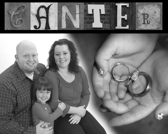
This past Christmas was my sister and her husband’s first as a married couple. I wanted to get them a gift that was a family gift.  Something that would go well in their home and something that could be kept around. I decided on Name Art.  I’m sure you’ve seen the pictures that are taken or cropped to look like letters.  Well, there is a whole site that has different shaped/colored fonts of letters and they are free to download. Click here to view that website.

I chose two recent photos; one was from their wedding.

The other was from a recent family photo session they had done.

Then I chose the letters.  It was really hard at first to choose the right ones but after spending a couple of hours on the first two letters, I finally just picked a random page and made myself choose a letter off of that page.

I meshed them together in Photoshop, did a little fancy erasing and blending, then turned the whole thing black & white. I had the photo printed as an 8×10 at Walgreens.  I framed it in a nice black frame that had a nice double matting, which I bought at Walmart for an inexpensive price.

And this is the finished product – without the frame.

This is a great, inexpensive, personalized gift perfect for upcoming weddings!


Getting Started In Raised Bed Gardening: Building Your Raised Bed

It’s mid March, and for me that means a case of Spring Fever.  As a fan of playing in the dirt it also means that its time to prepare for my 2012 garden.

Last year I began a style of gardening which was new to me: Raised Bed Gardening.  I was amazed at how easy it was to maintain, and how many things I was able to grow in such a small area.  I was also surprised at how simple it was to build a raised bed.  This year I decided to add two more raised beds to my yard, so back to the home improvement store I went.

Before you build a raised bed you need to determine the size limitations of your yard.  A flat area that receives a good amount of sunlight each day is key to a successful growing environment.   Decide the dimensions that are appropriate for the space you have available and buy the lumber accordingly.  You don’t want to make the bed more than 4-5 feet wide because you want to be able to reach in to plant and harvest without having to walk in the bed; however, it can be as long as you like and have space available for.

They say nowadays that treated lumber doesn’t contain chemicals, but I made the choice to go with untreated lumber.  Do whatever you personally feel comfortable with.   For my boxes I bought 3 boards which were 16 feet in length and 12 inches wide.  I had the boards cut into four 8 foot boards and four 4-foot boards.  The handy fellows at the store will be more than happy to cut the boards to the lengths that you need and load them into your car.  I also purchased 8 L-shaped brackets and a box of 1 ½ inch length wood screws.  If you don’t have a drill, you may want to borrow one, or you could just use nails although I think wood screws are a sturdier option.

For aesthetic purposes I checked the boards to see which sides had markings or factory print on them and made that the interior side which would be covered by the dirt.

I took each 4 foot board and screwed a bracket mid way up the board on the interior side of the board.  The bracket should be touching the edge of the board on each end of the board, but not going over the end.

I then raised the 8 foot board, made sure the edges lined up so that it would be as square as possible and then screwed the bracket into the longer board.  I repeated that process on each corner and voila it was done!

Next time I will review weed barriers and how I chose my soil.


When It Comes to Exercise, Variety is Key!

If you’re just starting an exercise program, trying to lose a significant amount of weight, or just trying to get rid of those last few stubborn pounds…the solution is the same. You need variety in your workouts.

There are 3 types of cardio:

Steady state (also called fat burning or low heart rate) – This is where you exercise at a low intensity with the purpose of burning your fat stores. This is best done first thing in the morning before you have eaten. Depending on your age and resting heart rate, you can determine your “fat burning target zone”. My heart rate has to stay between 125 and 135.

Interval training – the fastest and most effective way to burn calories. This is also the best cardio for what experts call the “afterburn”. Meaning your body continues to burn calories after you have finished exercising. Interval training consists of a 5-10 minute warm up, 20-30 minute interval workout, and a 5-10 minute cool down. You can do this on the elliptical, step mill, treadmill, or bike. The goal is to go hard for a short period of time, then recover for the same amount of time (or just a bit longer). I have done sprints on the treadmill, running as fast as I can for 1 minute, then recovering at a jog pace for 2 minutes. I have also used the elliptical machine for interval workouts, going hard for 1 minute, recovering for 1 minute. You can also do shorter bursts of intensity – go hard for 30 seconds, recover for 1 minute. Pick the machine that works best for you. And remember, this is not supposed to be easy. I am usually out of breath by the end of my intervals. I suggest doing interval workouts twice a week. Although they are key for torching calories, they require the most recovery. So alternate interval workouts with steady state cardio.

Medium intensity – basically a cardio workout in between steady state and interval training. You need to get your heart rate up, but not as high as interval training. When I need medium intensity cardio, I usually run outside or on the treadmill or use the step mill. I can increase the speed if I need to, but I can also back off if the workout is getting too intense.

It is also important to vary your workouts week to week and month to month. If you do the same cardio and weight routines week after week, your body gets conditioned to those exercises. You need to switch it up because the more variety you incorporate into your workouts, the more you can challenge your body. Different exercises work different muscle groups and it’s important to use them all. If you’ve never tried Spin or Zumba, give them a whirl. You’ll be amazed when you are sore in places you aren’t accustomed to!

The Secret to Losing Weight

The secret is, there is no secret. I know, I know…you’ve heard that before. But believe me, it’s the truth. I will be totally honest with you and tell you that all of the infomercials, exercise equipment, gimmicks, diet fads, and all the promises you hear on television WILL NOT WORK if you do not change your eating habits.

Sure, you can get a Brazilian butt lift and 6 pack abs…but not if you eat the wrong foods. No amount of exercise can compensate for bad eating habits. I don’t want to sound mean or disheartening, but the principles are fairly simple. Eat right, exercise, and stay committed!

I always thought that I was a pretty healthy eater… and I am in comparison to a lot of people. I have always maintained my weight and never really been out of control (except for the 10-15 lbs in college). But I also never had toned arms, lean legs, and ripped abs like you see on tv. Well, thanks to my trainer I found out why. It was my diet! If you eat sugar, sodium, and processed/packaged foods (even if they are low fat), they will prevent you from achieving that lean physique. As soon as I changed my eating habits…wow, I started to reveal a super flat stomach!

And it was essentially about getting back to the basics. Eating whole foods in their most natural form. Instead of instant oatmeal already packed with sugar, buy plain oats. I love adding cinnamon, a little brown sugar, or honey. It also tastes really great with a little spoonful of peanut butter. I have also discovered truvia, which is a natural sweetener, and so much better for you than sugar.

Instead of eggs, try egg whites. Or one egg with 3 egg whites. I sauté onions, mushrooms, and sometimes zucchini to add to my whites and then just a pinch of salt and pepper. Eat that with a bowl of oatmeal, high fiber cereal, or put it on a piece of whole grain toast. You will save so many calories and it tastes so much better than something from a drive-through.

Stick to lean protein – skinless chicken breast, lean ground turkey, flank steak or filet, pork tenderloin, white fish, shrimp, scallops, and salmon. Cook in just a little bit of olive oil, salt and pepper. Or season with Dijon mustard, spices and herbs. You don’t have to drown meat in heavy soups and sauces to make them tasty. It’s all about the basics.

Fruits and vegetables – really, you cannot eat enough! And variety is key. Try to eat as many colors as possible. Apples are great sources of fiber as well as strawberries. Blueberries are loaded with antioxidants. Oranges and mangos have tons of vitamin C. Bananas are a staple at my house. I have one after a morning work out because they are a great source of potassium.

My favorites vegetables are mostly green – broccoli, brussel sprouts (don’t knock them until you try them), green beans, kale, and cabbage. Peppers are also great for you as well as onions, squash, and carrots.

Try to eliminate “white” foods. Opt for whole wheat/whole grain bread instead of white. Sweet potatoes instead of baked potatoes. Try brown rice, quinoa, or barley instead of white rice. Whole grain noodles instead of white. If you eat cereal, try high fiber or brands that have less than 5g of sugar per serving.

This may all sound boring to you, and you feel like you are depriving yourself. But if you cook things and add the right flavors, everything tastes great.

And the bonus – you can eat MORE! When you eat whole foods, nothing processed, the amount of food you can eat increases while the calories decrease. Even my dad was amazed at how much food I was consuming when I was training. But that’s because lean protein, fruits, and vegetables don’t have many calories. Yet, they are packed with important nutrients and vitamins for your body.

So if you are stuck in a rut and can’t get those last 10 pounds off, take a closer look at what you are eating. It makes a world of difference!

Graphic Design: Helpful Hints

I’m a perfectionist. I understand that everyone makes mistakes. Believe me, I will likely have my fair share in this blog alone!! However, I find that I over-analyze most things in the graphic design world. I guess this stems from my many years in the business, working my way from a Typesetter in a print shop to an Art Director in a publishing company. Every employer instilled an attention-to-detail in me that apparently is here to stay.

I usually have to glimpse through a publication, like a weekly sale advertisement, on multiple occasions. The first time I view it, I have a tendency to size-up the actual layout. I observe typography, margins, and bursts. I make mental notes of what works, and what doesn’t. It is only the second or third time I flip through the ad that I actually pay attention to the products and their pricing.

I will also analyze invitations, flyers, and mailers… nearly any print material I encounter. I love to see how designers use color, be it effectively or not. I appreciate a good company branding, but enjoy an out-of-the-box design too. I will even analyze paper and printing techniques, and will keep some on hand to use for conceptualizing later. I’m not sure if these assessments are a healthy habit or a curse.

One consistency I find in graphic design… primarily from designers who have limited experience, or more so, those who call themselves designers simply because they have a computer with Microsoft Office… is a lack of detail. Do they analyze items that they have readily available; like magazines, brochures, or posters? Is there a desire to learn copy-writing tricks-of-the-trade for accurate grammar? What kind of emotions are you putting behind your typography or color pallet?  I would like to share three quick Helpful Hints that will benefit any designer, no matter their skill set.

1. If you know this is going to be printed professionally, call ahead to request printing specifications. Based on the piece you are designing, the printer may have several printing options. To save time and money, for both you and the printer, it is best to set up files correctly from the beginning. Take into consideration: margins, bleeds, colors, and format. Microsoft Word is NOT a layout program. Although it is feasible to create something out of it, the file usually causes most printers a lot of heartache. You want to deliver a file that the printer will not have to manipulate before printing. This will cut down on your printing costs, and shorten turn-around time.

2. Proofread your work. There is often a preoccupation with producing a creative design. Too much attention to the appearance of a piece could hinder you from missing an obvious mistake to the basic information. (Case in point: one of my first professional design jobs, I left the L out of the word public. No one at the printer reviewed my work, as it was presented to them as “print ready” and I had relied on spell check to proof my basic info. Pubic is a word, but the folks at the city’s utilities department were not very impressed that it appeared in their brochure.)

When dealing with clients, do NOT expect them to proofread basic information either. Often they feel if they have hired you to design the piece, you’re responsible for editing it as well. Pay particular attention if you are simply re-design a previous piece, or they have requested a consistency in their material for branding purposes. If it looks familiar to everyone involved, no client will read it carefully.

Lastly, if you are dealing with a large group (I have found this to be true with larger non-profit organizations) there tends to be too many people are involved in reviewing the information. Everyone thinks someone else is paying attention and catching mistakes, and therefore, no one person feels totally responsible to carefully review the invitation, specifically looking for mistakes and omissions.

If you feel uncomfortable with copy-writing or editing, there are some excellent resources online. However, if you prefer to work face-to-face with someone, contact your local advertising agencies. You can hire someone on a project-by-project basis, and often you will find that many of the copywriters and editors freelance in their spare time.

3. High Resolution vs. Low Resolution images. Obviously the higher resolution your image is, the larger the file will be. No one likes working with giant files placed into large layouts. It will slow your computer (especially if you’re on a shared network) and your productivity down. However, resolution is crucial to viewing quality. Don’t fall victim to the 72-rule. I still hear the advice, “Computer screens show images at 72 dpi, so scan all of your images for the screen at 72 dpi.” Although dpi is more flexible on screen, it is crucial to have the highest dpi possible in printing. Typically, printers encourage designers to use 300 dpi, an industry standard.

I plan to post more Helpful Hints blogs monthly, not only for graphic design but also for photography. Please leave me a comment to let me know if the tips I post are resourceful, or if you would like me to cover a specific topic.

Happy Designing!